Giving delight to a boring assessment
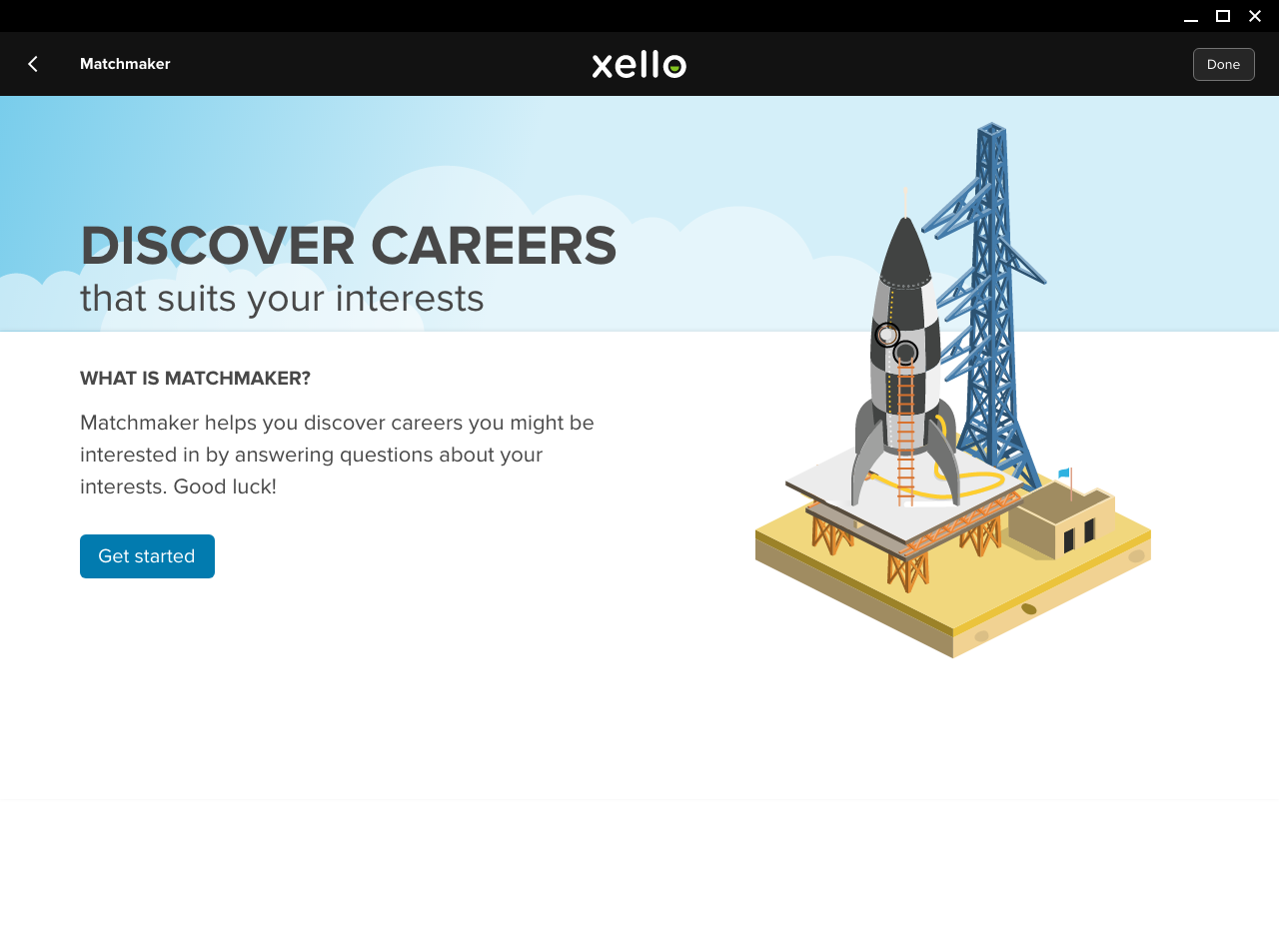
These tests are commonly lengthy and unappealing. To address these challenges, I incorporated thematic elements which deal with exploration (space). As is common with projects that are beginning from scratch, they tend to undergo constant iterations as time goes by. Since this projects was one of the first to be rolled out in the new app, the original design I worked on which was implemented has undergone stages of iterations. Below is my personal attempt to remaster the original design using a matured styleguide existing in the current app.
The Phases
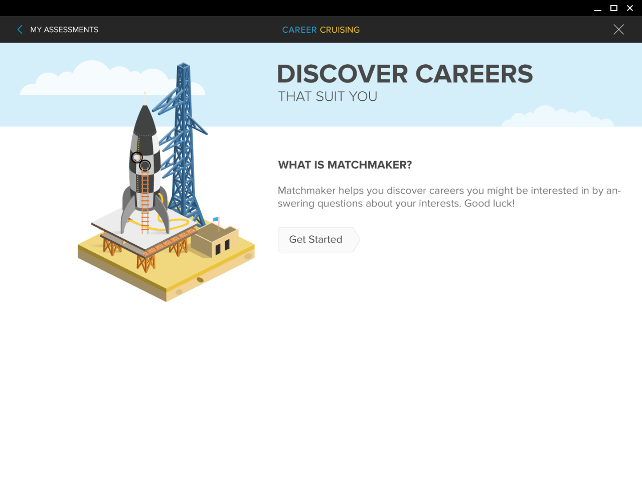
These assessments because of their length are broken down into 3 parts from its implementation. The company did not have user experience as a priority, therefore these assessments were very technical in perception. To give it some engagement, I incorporated the idea of SPACE EXPLORATION and their phases whithin the context of the assessment. This seems fitting, since our looking into what we may want to be in the future is indeed an exploration. Since assessments are made up of phases, why not parrallel them with space exploration, which is also broken up into phases from launch preparations, flight, and landing.


Consistent Selectors
In later iterations after more than a year, I was given the task of updating the education preferences set by students. They enable students to see content based on these preferences. Consequently, they were meant to be an updgrade not just under the education preference but also in the assessments, for they are inherited from there. With the new selectors implemented, it made sense for me to also inherit them onto the quiz selectors of my original design. They are rounded to give a hint of their behaviour, namely as a quasi radio button.


Below the fold continuity
One of the requirements in the original design was to as best as possible place all substantial information above the fold. For Career Cruising, this was above the 500px vertical height considering bookmarks and chromebook displays from our users. This was concluded from our technical research which was found common in our users at the time. With this new redesign, I incorporated content into vertical sections, while providing UI elements that can give clues to the user of exising content below the fold. These UI elements came in form of a chevron, and iron selectors. The solution in my opinion prevented information cramming above the fold, which overwhelms the user.


The dna metaphor
Learning style assessment is a test by which students receive insight into their personal learning dispositions. It is helpful in the sense of giving them knowledge as to how they learn, as well as obtaining for them tips on how to optimize their learning based on the results. Since this test has reference to personal dispositions, it was apparent to me that it is an assessment that has an aura of personal identity. DNA contains human traits that are unique to each individual. Why not create a metaphor for this assessment as a DNA test, so as to give to the user a notion of their own uniqueness. So for engagement, I made it as if they were taking a DNA test in a lab. It gives a dimension of delight to that requirement in the software for students to know themselves as a preamble.


Your learning style traits
The original designs were crammed into one page. I wanted to simplify by isolating each one on its own page while incoporating an editorial style layout. I believe this improves readership when there is substantial amount of reading involved.


